The above is the 1st idea for the logo. In short, CJ Ignition (Customer Journey for Travel) is a consultancy company for the Travel industry, all aspects related to Travel, retail or business, including air, hotel, car, ships, rewards etc. We basically wanted to give the idea of a segmented shape, where each separate segment would correspond to one aspect of what the company is meant to cover in their travel consultancy process, like steps of a journey. No serif, rounded fonts would be nice and smooth, as the process itself is intended to be. Although this logo seems nice, linear and straightforward, it was discarded because the rounded circle and segments look too much like a fan!
This study has been picked as the definite logo. A circle with an opening, whose shape alludes to a flame, a ring of fire. The colour of that ring can be changed as needed. The blocky, chunky typefont is easily stackable and, again, the curves make things look smoother and rounded up.
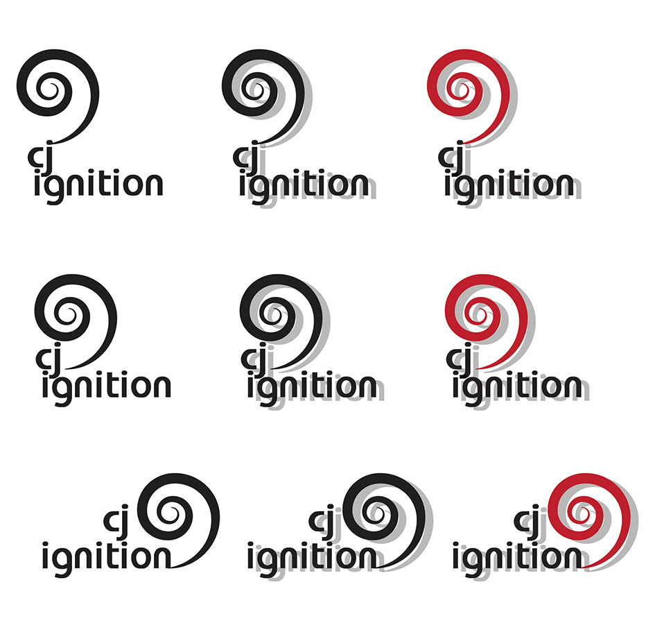
This design is my favourite because it looks cute. Three basic variations from top to bottom, expanded into the same B&W logo with shadows and a coloured version using a shade of red/fire. The spiral and the distribution of letters use the Golden Section and seem harmonious. The spiral not only suggests a journey, but also denotes an organic process and continuous movement.

This study is again based on a shape and its different components. The hexagon is almost a circle, and easily sectioned. The use of different colours and the position of the dettached slice here can be easily changed to accommodate different products, as required.
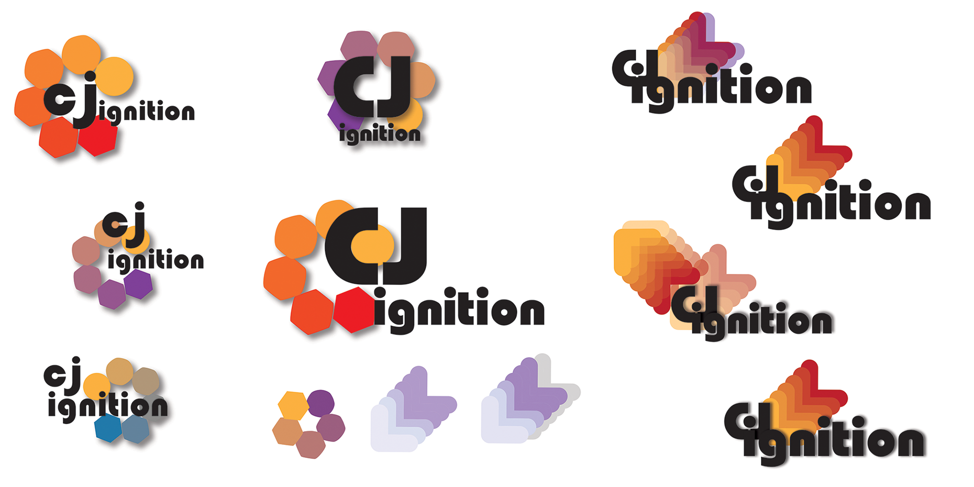
This final study derives from the previous one: the idea of the hexagon blending into a smooth circle, a more enhanced shape. Blues, purples and yellows again refer to the colours of a flame, changing from one to another. The circles also end up forming the arrows, which vaguely remind me of airline seats. In the last three logos, the C, J and I resemble a human shape, head and arms. However, at the same time, it makes the reading harder: if you are not used to that typefont, you may ask twice how the CJ shape can be read: CJ? CI? Somehow pretty because colourful, but impractical.
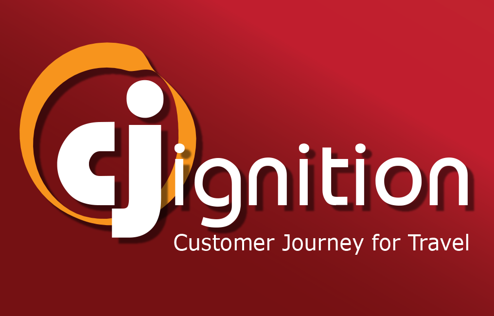
In the end, this one has been selected as the final logo!
Enjoy!